


A Visualization of Gun Violence in the U.S.
The Motivation
Given all of the recent events in past months as of writing (Las Vegas and Sutherland Springs mass shootings), the motivation behind this small write-up was entirely driven by news rocking the nation. Gun violence and control has been hotly debated both politically and socially for a measurable amount of time in the United States now. While this writeup is not intended to be partisan as it does not explore the effects of gun control legislation on gun violence, I have to admit that it was extremely disheartening that I had to recompile my data three times after I initially started as a result of three more mass shootings. I started this project to understand and visualize the history of gun violence in our nation after the heartbreak in Las Vegas. The Sutherland Springs shooting, a shooting in Northern California and a Thanksgiving day shooting were three standout data points among other gun violence incidences that occurred after I started this dataset.
To preface the rest of this write-up: this is not meant as a very technical analysis but rather a fun little side project to explore something I was curious about and had social relevancy.
The Data
For something so contentious and societal, good data about gun violence, incidents and deaths were surprisingly hard to find. Perhaps on no small part of the NRA, datasets were pretty disparate and few datasets had complete information to do anything visual with other than a few line graphs or bar charts. After some research I settled on two distinct datasets.
CDC Wonder Database - The CDC actually maintains a database (to the best of their ability) of all recorded deaths in the United States with cause of death. I issued a query to their service and retrieved a dataset spanning from 1999 - 2015 containing gun related deaths by state and gender.
Gun Violence Archive - This online archive contains information on every mass shooting incident starting in January of 2014 up to current day. The data includes the number of individuals killed, number of individuals injured and address/location of each incident. The data used here does not even include accidental deaths/injuries, teen injuries/deaths, nor children injuries/deaths. The Gun Violence Archive is also not a complete source of information but rather does their best to track down and associated every incident with a news source.
First Impressions
Right off the bat, it’s shocking how much data is missing even from the CDC database. A few states like North Dakota, New Hampshire and Vermont actually don’t have any recoded data with the CDC. I highly doubt there were no firearm related deaths and while there are normally techniques for treating missing data, the complete lack of data meant I couldn’t really prescribe any pre-ordained value for plotting. Other states like Wyoming were missing data for certain years while others like Rhode Island only had data only on male deaths. As mentioned before, what’s difficult here is ascertaining whether there truly were no female deaths (in the case of Rhode Island) or if the CDC has incomplete data. In either case, I did not do any special handling of missing data and instead chose to denote the lack of information.
While the CDC database listed deaths by years and months for each state, the Gun Violence Archive dataset listed out each individual gun violence incident. As of time of writing, there were 1,296 (actually just over 1,300 but a few data points were thrown out for reasons explained in the next section) unique incidents where at least one person was injured or killed. From January of 2014 when the dataset begins to November 2017, that’s an average of 27.5 incidents per month. That’s nearly one a day. I had to let that sink in. As a nation, we only hear about what we define as mass shootings but according to the dataset (which may very well be missing data), there is nearly one shooting a day. The rate may have sped up or slowed down throughout the timeframe, but just looking at the big picture, the crude rate is appalling.
Data Cleaning
Some pretty basic stuff here and most of the data cleansing was to prepare the right information to plot geographical data via Plotly. For the CDC database, this basically meant I had to create a DataFrame with every unique permutation of Gender, State and Year in order to have rows that would correspond with data for a state and gender per plot. Interestingly enough, District of Columbia was an enormous outlier with an extremely high gun violence rate because of it’s small population so the plotting function takes an argument on whether to include D.C. data since it greatly outsizes the gun violence rate of any other state.
The Gun Violence Archive provided some more interesting data. Every row provided an Address, State and City/County. What I really envisioned doing here was a bubble map where incidents were plotted with a marker whose size was directly related with the number of individuals either killed or injured in the incident. However, the Plotly APi understandably calls for information on latitude/longitude to plot these geographical locations. Clearly not scalable by hand, I used the Google Maps API to actually feed each Address, State and City/County to perform a fuzzy search using Google Maps and return the geolocation according to Google Maps. A few points had to be thrown out because even they were too vague for Google Maps to return information. The information was appended to each row and then dumped into a pickle file for quicker loading when the main script ran. The cleaning in the main script was simple enough; just a few conversions of datetimes and aggregation across months and years.
Visualizing the Data
Understanding Trends
A quick look at the CDC dataset revealed that there were 6 - 8 times as many firearm related male recorded deaths than female deaths. I’m careful not to state that there are 6 times as many deaths for males or males are 6 times more likely to die as that cannot be inferred from the data directly since the CDC database only returns data that is actually provided to it.
I was also curious to see how each state was trending in terms of firearm-related deaths. I decided that a heat map portraying state vs year data would be a good way to visualize trends as well as identify any clusters or groups of years that may have experienced increases across multiple states. To do this, I first cleaned out the data frame to only retain states that had complete data for all years spanning from 1999 - 2015. I then broke each data set up by gender and then defined a metric as either year over year change or a net percent change from 1999. Again, this is a comparison of death rate and not actual deaths since one would fully expect the number of actual deaths to increase as our population scales. Below, is the net change in firearm death rate:
Percent Change in Firearm Death Rate Female-Net Percent Change
Unfortunately, it looks like even though we are looking at the percent change in rate of firearm deaths, the latest year seems to have nearly every state increasing in death rate for males. While it seems like there is a weak "hotspot" from 2000 - 2008 where firearm death rates were higher than the 1999 baseline followed by a "cooldown" from 2009 - 2014 where many states saw a lower death rate, New Jersey, Louisiana and Ohio seem to have firearm death rates that have been perpetually higher since 1999 for males. Looking at the heat map for females, we see a lot more blue signaling lower firearm death rates compared to 1999. Something of note is that while the heat map for males tends to have general trends that seem to have ebbs and flows, the heat map for the female firearm death rate has certain years that truly stand out. While most states tend to see the same increase/decrease for both males and females, it's interesting to note that a state like Alabama has only seen consistently lower firearm death rates for females while seeing consistently higher firearm death rates for males. Something to note is that we cannot discern any kind of trends in the data given this metric as it is comparing each year to a static year (1999).
To alleviate the inability to observe trends, we take a look at how the firearm death rate is evolving year over year:
YOY Male Firearm Death Rate Change YOY Female Firearm Death Rate Change
The heat maps above are much more tempered in a passing glance. Looking across the years for each state, it doesn't look immediately obvious that there are any trends developing. Sure there are ebbs and flows but they very may well be just ebbs and flows before regression to some kind of mean. This is far more evident when in the heat map for females when we can observe that, very frequently, years that saw increases in firearm death rate immediately see the next year display a decrease.
Unfortunately, while heat maps are great at identifying outliers and pockets of interesting data, the human eye is decently poor at discerning subtle trends. To delineate this, a simple time series plot might illuminate any trends:
Above is a time series plot using data from all states with complete data where the line is the mean rate the shaded regions represent the 95% confidence interval. What we see is vaguely similar. Something that catches the eye is that the trends for the female group seem to more erratic with wilder swings like from 2008-2010 while the male group portrays a steady decline. Something that both the heat maps and the time series plots above reveal is a sharp increase from 2014 - 2015. I'd be curious to investigate whether there was truly such an enormous increase or if the way the CDC collected information changed such that they received more accurate data on the number of firearm deaths.
Mapping It Out
For the CDC dataset, a choropleth (maps where regions are shaded according to a defined scale for some characteristic) was generated via Plotly for every year by gender. The initial impression is that California far outpaces any other state in terms of number of firearm related deaths. While this may be true, it’s pretty obvious that California also has a much greater population than the vast majority of other states. It may be subtle here but we can also observe states in the east trending towards a darker color from 2006-2008 like observed in our heat maps.

Below we see that the plot for female deaths is on a different scale with the number of firearm related deaths at nearly a sixth of the amount. The coloration of the states also seems to imply that female related firearm deaths are ever so slightly more homogenous across the different states. In particular, Texas and Florida stand out more.

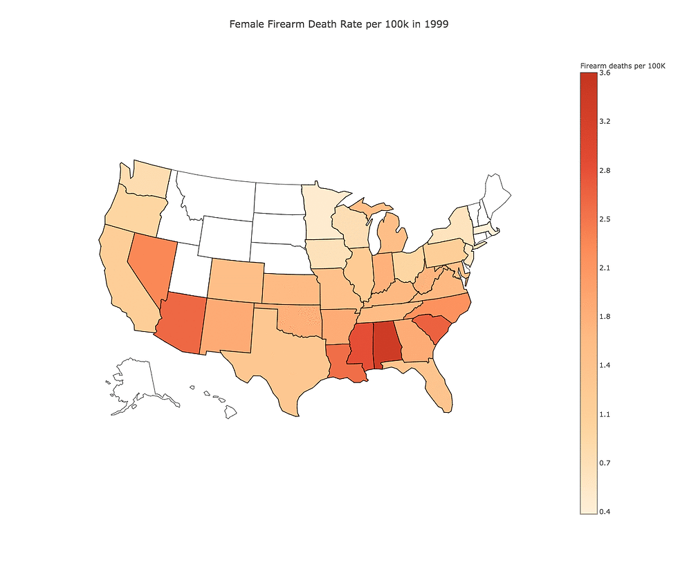
Unsurprisingly, looking at raw number of firearm deaths per state doesn't really paint an accurate picture. The below two choropleths show the firearm rate of death per 100K. Unfortunately, the CDC had very incomplete population data for quite a few states so those show in white. While there are techniques for filling in missing data based on averages, last-non-null, etc I decided to leave those techniques out since most of the states affected are not really the ones that are interesting per se. Now looking down below we actually see that California isn't really all that higher in terms of firearm death rates. The states that stand out much more now are southern states like Louisiana, Alabama and Mississippi while Maryland towards the Northeast is worth noting as well.

In an interesting turn, the choropleth for female firearm death rates has spikes in states that really don't align with the states seen above for males. However, many states "light" up in certain years as opposed to a gradual progression towards a higher firearm death rate as seen in the male choropleth seems to indicate that, since the incidents are less common, death rates in certain years are stand out years almost akin to outliers. While certain states demonstrate similar patterns (Mississippi and Louisiana), others like Nevada, South Carolina and Arizona stand out in certain years whereas they do not in the choropleth for males.
2014 and Onward
In my search for data on actual locations of gun violence, I found the website Gun Violence Archive which is a third-party, non-partisan aggregator of all gun violence incidents involving at least one person killed or injured. As mentioned earlier in this post, I used the Google Maps API to retrieve the latitude and longitude of each incident based on the address/location description provided by the Gun Violence Archive.
As some basic exploratory analysis, below is a set of bar charts portraying the number of individuals killed or injured in each month from January 2014 - November 2017. One can vaguely prescribe that there might be some kind of light seasonality here where it seems there are more gun violence incidents during the summer months. It also goes with saying that the Las Vegas tragedy in 2017 which inspired this post significantly dwarves all other months and years in terms of sheer number of casualties.
Another thing I was interested in taking a look at was the frequency of number of individuals involved in each incident. Below is a histogram of the number of individuals injured or killed across incidents. I actually had to restrict the graph to less than 10 people injured or killed otherwise the graph was extremely long tailed to the right since there were very few extreme instances where dozens or even hundreds of people were killed or injured. What we see below is kind of interesting in my opinion. Looking at the number of occurrences where individuals were killed in a reported incident, we see that it seems distributed much like one would expect: there are progressively fewer incidents as the number of people in the incident are killed. What stands out more is the histogram for the number of incidents for the number of individuals injured. Whereas the histogram for the number of incidents for the number of individuals was nearly monotonically decreasing, the histogram for the number of injured is practically bimodal. What this seems to almost imply is that in many cases, the cases where only one individual is killed seems to be targeted where only that one individual is targeted. On the other hand, the bimodal nature of the number injured seems to imply that the perpetrator was likely injuring an indiscriminate number of people as a standalone act or after killing their one primary target. Admittedly, this is a vague theory at best but could be substantiated by doing a histogram of the specific combination of number of individuals killed and injured in the incident.

Visualizing Gun Violence Incidents
In all the graphs, charts, and illustrations I've seen of gun violence across my search, I've never actually seen anything that plots the physical location of each gun violence incident. I strongly believe that seeing each incident plotted by location has a much stronger visual and visceral impact than graphs which almost desensitize the impact of the data by abstracting it into a higher level statistic that allows the user to consume more information at once. Below I have plotted every incident listed on the Gun Violence Archive where the size of the bubble corresponds to the number of individuals injured.
Injures - Gun Violence
A few standout incidents are:
June 2016: Pulse Music Shooting in Florida
50 Killed, 58 Injured
July 2016: Fort Myers Shooting in Florida
2 Killed, 17 Injured
October 2017: Las Vegas Shooting in Nevada
59 Killed, 546 Injured
November 2017: Sutherland Springs Shooting in Texas
26 Killed, 20 Injured
Concluding Remarks
This was not an easy set of data to investigate. Not only was the data difficult to compile, but the act of sifting through it and realizing how all these tragedies were reduced to a single line of data was a sobering thought. I leave it to the reader to interpret the data as they will; I've tried not to insert too many subjective opinions in this write up and just leave the visualization of data as is to allow the reader to consume it.
From technical perspective, the Plotly API was great in the sense that it provided a more aesthetically pleasing way to plot choropleths and bubble maps compared to many other packages. However, I found it to be plagued by poor documentation and some finicky behavior.
As always, drop me a comment or note if there is something that you found concerning or have some simple suggestions about what to build upon.
Comments