


It's lovely weather for a bike ride
For those out there who love exploring cities or commuting on bike but don't want to worry about the cost of ownership, maintenance, or worrying about theft, bike-sharing is a great solution that many companies aim to offer. Perhaps one of the most prevalent options in the Bay Area would be the Ford GoBikes which are easily identified by their comically bulky and touristy look.
I distinctly remember while completing my consulting project for my Masters of Engineering that one of the available projects was an exploration into ride analytics and operational efficiency for bike-sharing when it was first introduced in NYC. While I wasn't assigned to that project, that problem has always lingered in the back of my mind. Fortunately, the Ford GoBike program has made all of their bike ride information over the last year publicly available. This data includes information about ride duration, gender, user type as well as the start and end stations.
While I've completed some fun, lighthearted data analyses (shameless plug for my post on popular baby names), this seemed like an analysis that could actually provide insight if it were conducted in industry. Without further ado, let's jump into it.
The Data
The dataset provides information on about 1,338,864 rides. Included in the data is information on factors such as:
Ride Duration
Birth Year
Start Station (Name and coordinates)
End Station (Name and coordinates)
User Type (Subscriber, Customer)
For user types, customers are those who, as of time of writing, pay $2 for a one-way trip up to 30 minutes or pay $10 for 24 hours of access with unlimited 30 minute rides. Subscribers pay $15 a month of $149 for a year for unlimited rides up to 45 minutes. For both plans, it's an extra $3 per 15 minutes over the limit. Based on that rate structure, I expect to see sharp drop offs in the ride duration after the defined cut off for each user type. More information can be found on the Ford GoBike website.
To do some initial data cleaning I split up ride start times into month, year and hour components to set up the data for some easy visualization. Additionally, I extracted the day of week from each date. After looking at the Ford GoBike site to understand their list of locations, I found that the stations available in their system never had overlapping longitudes when split by San Francisco, East Bay, and South Bay locations. As a result, I created a new DataFrame column for 'region' based on the stations longitude.
Whenever I have to work with larger datasets that require lots of pre-processing and wrangling, I prefer to process and then pickle the data. For those unfamiliar, I totally recommend looking into the pickle package for data serialization which gives you faster access to pre-processed data.
The Questions
Perhaps it's just part of my inquisitive personality but I always had questions swarm my mind whenever I saw bike sharing systems. Now I finally have the data to answer a number of those which include, but are not limited to:
Do people of different ages ride for different lengths of time?
Surely there are more popular and less popular stations; how would Ford understand which those are and how to operationally restock the ones with shortages?
Do different customer types exhibit different ridership patterns?
Does the day of week influence what the population of riders looks like?
Initial impressions
The Ford GoBike system has made data publicly available from June 2017 to time of writing (July 2018). Over the past year we can see that the number of rides taken by subscribers (represented in blue) has increased significantly versus the number of rides by regular customers (represented in orange).

Of the 1,338,864 rides, The vast majority of them take place in San Francisco which is unsurprising given the relative popularity of biking as a method of commuting in urban environments as well as San Francisco's population relative to East Bay and San Jose.

What was a little more surprising though was the ratio of male to female riders. Whereas I would expect something along the lines of a 50:50 split (or slightly more skewed to males given the potential tech worker user base), the actual ratio was more like 75:25.

Lastly, subscribers take the majority of rides. Unfortunately, there's no customer ID in this dataset so there's no way to tell how many of these are unique rides. If we had that data, we might expect the ratio of rides taken by unique subscribers to customers to be significantly lower as subscribers likely take many rides to get the most value out of their subscription.

Now what if we look at the distribution of rides by some time component? Naturally we'd expect more rides during the day with minimal rides at night.

Looking at the above, we're indeed correct that fewer rides occur at night from the hours of roughly 10PM - 5AM. However, what is more interesting is the spikes in rides around 8AM and 5PM which perfectly align with rush hour for commuters. A relatively small peak happens around noon which we can assume are lunchtime bike riders getting out of the office for a bit. Given the imbalance in the data with regards to user type, we'd expect that the distribution be skewed by that user type so we can just split the graph up by user type:
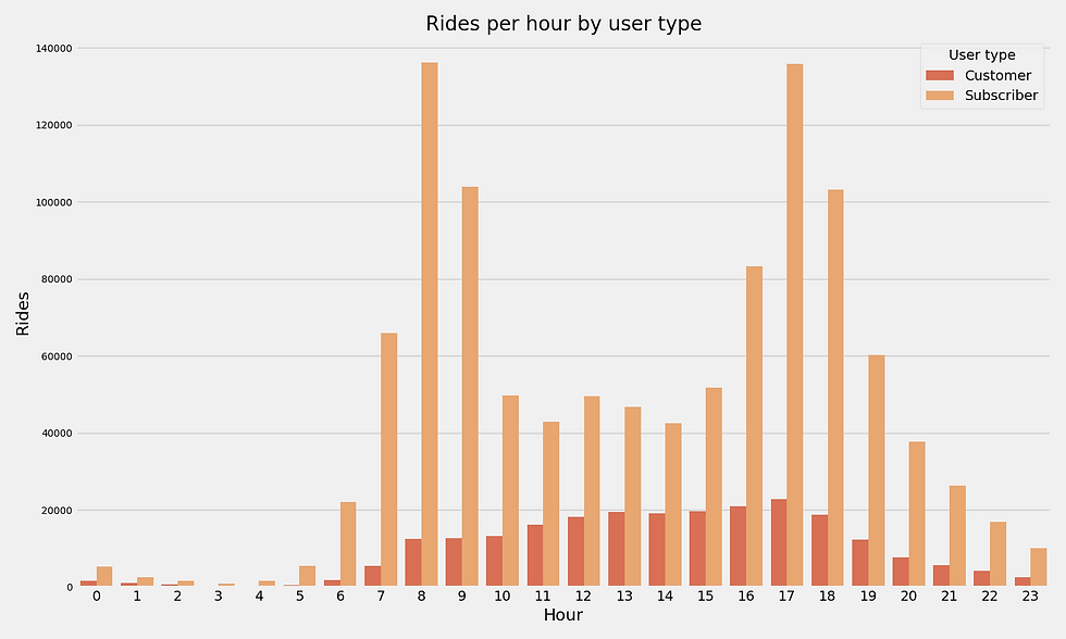
As we thought, the sheer number of rides taken by subscribers skews the data by contributing the majority of information to the distribution of rides. What we see above is that regular customers take rides relatively uniformly through the work day before dropping off around 6PM. This makes sense since commuters wouldn't get the best bang for their buck as a regular customer; being a subscriber makes much more fiscal sense.
Dissecting our user base
Now that we've seen a high level overview of who's riding these bikes as well as when, there's still a good amount of insight to glean with a little more data cleansing and manipulation. What I was particularly interested in was the distribution of ages and ride durations what effects gender and user type had each of those.

Distribution of Ride Duration
What we see from the initial histograms above is that we have some very long-tailed data meaning that a small part of a given distribution contains most of the data whereas a large part contains very little. This is especially pronounced when looking at ride duration. For the age distribution, whereas even 80 years old may be a stretch for a rider, anything above 90 just seems really unlikely and we might be able to chalk that up to users entering an incorrect DOB. Even more extreme is the ride distribution histogram. While there are instances of rides being upwards of 80,000 seconds, the vast majority occurs well below what appears to be 10,000 seconds. In fact, when we crunch some quick numbers:
Percent of rides under 10,000s: 99.2%
Percent of rides under 4,000s: 97.87%
Percent of rides under 2,000s: 95.2%
Percent of rides with user under 90 years old: 99.9%
Percent of rides with user under 80 years old: 99.5%
Percent of rides with user under 70 years old: 99.5%
In order to narrow down our data to the set that will provide us the most insight about general ridership patterns, I narrowed our dataset down to rides where the user is under 70 years old and the ride duration was under 2000s. Interestingly enough, 2,000 seconds just over 33 minutes and we can see in the last histogram that the number of instances of rides greatly drops off as the ride length approaches 30 minutes (1,800s) presumably due to the rate structure.
After slimming down the dataset a bit we're left with 1,172,843 rides to examine. To better understand the distribution of age and ride duration by different categories, we'll throw the data into some cat-and-whisker plots (or boxplots as they're named in the Seaborn package) and violinplots. While boxplots are a standard for understanding median and quantiles, they're not particularly conducive to understanding the granularities or localities of the distribution. To remedy that, violinplots provide a smoother portrayal of the underlying distribution.
Age distribution by gender
What we see above is that the median age for all genders is roughly mid 30s with negligible variation across genders. Again we see a decently long tailed distribution with the majority of users being under the age of 40.
Age distribution by user type-boxplot
What I did not expect was for the median age for subscribers to be higher than that of customers. My original assumption was that subscribers might be tech workers around SF that were more comprised of millennials but it seems that customers not only have a younger median age, but an even tighter underlying distribution around that median age.
Age distribution by gender and user type
Unsurprisingly breaking grouping the data by gender and subscriber type reinforces the above observations, namely:
Female riders tend to be a bit younger than male riders.
Subscribers tend to be older than customers for both males and females though they are roughly even for customers that identified as "other."
One thing to note is that because the data is so imbalanced towards male riders, if there were an equivalent number of female riders, we may see the distributions converge on something more similar. Additionally, it's hard to make any inferences about the gender group "other." The dataset does not provide any guidance about whether other means (transgender, bigender, etc) or whether they are users that have not provided gender information.
At the suggestion of a friend (shout out to WIlliam Mau), I also ran an unpaired t-test for each of these to determine significance. For the effect of gender on age:
Male:
Mean: 37.268
Std. Dev: 9.996
n: 683,203
Female
Mean: 35.152
Std. Dev: 9.347
n: 196,358
Using an alpha of .005 and d.f.=196,357, we get a statistic of 83.887 which is significantly greater than the value defined by the t-table.
Similarly for the user type:
Subscriber:
Mean: 37.14
Std. Dev: 9.92
n: 801,384
Customer:
Mean: 33.59
Std. Dev: 8.856
n: 88,687
Using an alpha of .005 and d.f.=88,686, we get a t-statistic of 102.327 which is also significantly greater than the value defined by the t-table.
In both of these cases, we can surmise that that the age distribution for each population is significant and not just a result of chance.
Understanding ride duration
Beyond just understanding information about our users, what might be more interesting and impactful is how those factors affect ride duration and how they user the system.
Ride duration distribution by gender-box
Whereas ride duration by gender is pretty unrevealing, looking at ride duration by user type provides a much more rich understanding of ride duration distribution. While rides taken by subscribers are much more long tailed with the majority of rides being under 1,000 seconds (roughly 16 minutes), the distribution of ride duration by customers is much more uniform up to 2,000s. I think it'd be safe to chalk this up again to subscribers using bikesharing to commute where a 15 minute ride seems like a reasonable amount of time to bike to reach an office while customers may be using these bikes for things like getting around the city while sightseeing or potentially grabbing groceries. Subscribers may also feel the need to have their rides approach closer to 30 minutes to make best use of the fee they paid whereas this is not a concern to subscribers since their rides are unlimited.
Another thing that I thought may have an impact on ride duration was user age. To do this, I bucketed users into different age ranges running from the minimum of 18 up to 70 years old.
While I didn't expect to see much variation in younger to more middle aged riders, I was unsure of whether I would expect those in their later ages to take longer leisurely rides or shorter ones due to physical limitations.
Ride duration by age group-boxplot
Whereas the median ride duration was the same for most, it seems that middle-aged riders tend to have a tighter distribution for their ride duration. The one group that stands out is the bucket for 63-68 year old rides which seems to have a slightly higher median ride time and wider distribution. However, it's extremely important to note that this may be localized based on the bucket size I chose and how the data just happened to land in it especially since the majority of users are much younger than that age. If I expanded the age range to be 10 years for each bucket, I'd expect to see much more indistinguishable differences between each age group.
Station demand and popularity
Now let's try and understand some user patterns around the actual bikeshare stations. To do this, I took the top 10 stations by number of pickups (defined as bike ride had this station defined as the start station).
Rides by hour - The Embarcadero at Sanso Rides by hour - Steuart St at Market St. Rides by hour - San Francisco Ferry Buil Rides by hour - San Francisco Caltrain Rides by hour - San Francisco Caltrain S Rides by hour - Powell St BART Station Rides by hour - Market St at 10th St Rides by hour - Berry St at 4th St Rides by hour - Montgomery St BART Stati Rides by hour - Howard St at Beale St
What we see is that for the most popular stations, pick ups most happen around rush hour time both in the morning and afternoon. However, certain stations like Caltrain tend to have most pickups in the morning with a much lower pick up rate in the afternoon rush hour which can be attributed to commuters who are only picking up bikes from Caltrain in the morning after riding in from the Peninsula. On the other hand, BART stations are more likely to see a more even distribution in pickup across rush hour times.
Again, because the data is skewed by the sheer volume of riders that are subscribers versus customers, we should split out the plots by user type which presents the data below:
Rides by hour - The Embarcadero at Sanso Rides by hour - Steuart St at Market St Rides by hour - San Francisco Ferry Buil Rides by hour - San Francisco Caltrain S Rides by hour - Powell St BART Station - Rides by hour - San Francisco Caltrain - Rides by hour - Howard St at Beale St - Rides by hour - Market St at 10th St - C Rides by hour - Montgomery St BART Stati Rides by hour - Berry St at 4th St - Cus
What we see above is that for the top 10 stations by rides, customers tend to ride in the later half of the day with many bikes being picked up at these stations after 12PM. In fact, many of these stations are located near the waterfront on Embarcadero and Ferry building, a perfect location for a tourist-focused rides looking to enjoy a waterfront view.
Rides by hour - The Embarcadero at Sanso Rides by hour - Steuart St at Market St Rides by hour - San Francisco Ferry Buil Rides by hour - San Francisco Caltrain S Rides by hour - San Francisco Caltrain - Rides by hour - Powell St BART Station - Rides by hour - Montgomery St BART Stati Rides by hour - Berry St at 4th St - Sub Rides by hour - Howard St at Beale St - Rides by hour - Market St at 10th St - S
On the other hand, for these top 10 stations subscribers are again picking up bikes localized around rush hour. But are these still the most popular stations if we first divide the dataset by user type? To understand that we'll delve a bit into station popularity and bike surplus and deficit.
Bike surplus and deficit
An important part of any bikesharing system is understanding what stations will end up with a surplus or deficit of bikes. Naturally, from an operational standpoint, bikes may need to be relocated either manually by the company or riders will need to be incentivized to pick up from certain stations while returning to some others. Incentives like reducing the price of a ride or even offering it for free means that Ford can forego hiring individuals to relocate bikes nightly which would incur greater costs in terms of vehicles to move the bikes in, worker wage, fuel costs, etc all of which also remove bikes from operation.
To understand this, I took the dataset and split it into two sets of data each of which contained the data and user type. From there, one dataset contained the start station while the other contained the end station. Based on that we can know for every date and station how many bikes where picked up (ride has that station as pick up station) from that station while the other tells us how many where dropped off (ride has that station as drop off station). We can then join the two datasets and then calculate a net for each station which captures the net surplus or deficit for the day.
However, understanding the net surplus or deficit at each station on a daily basis doesn't provide much actionable guidance on how to potentially restock or reshuffle bikes. Something more useful would be to capture the net surplus or deficit on a weekday basis as it's much easier to understand, for example, where bikes might need to be moved from and to for a given day of the week. After doing this, I listed the top 5 stations in terms of surplus and deficit.
Subscriber top stations by bike surplus Subscriber top stations by bike surplus Subscriber top stations by bike surplus Subscriber top stations by bike surplus Subscriber top stations by bike surplus Subscriber top stations by bike surplus Subscriber top stations by bike surplus
What we see for subscribers, particularly on the weekdays, is that the greatest deficits occur around Caltrain stations and BART while a mild surplus occurs at intersections that are more residential. Caltrain might be attributed to all the riders coming in from the peninsula while the BART stops might be attributed to riders picking up bikes at the end of the work day and riding back to more residential areas. What we basically observe is that riders converge upon certain densely used stations like Powell BART and Caltrain but then ride back out to a much wider array of drop off locations. This ridership pattern may result in a greater deficit at stations serving commuters while replenishing and potentially over-saturating a large number of residential stations around neighborhoods like Mission, Hayes Valley, etc. This is further supported by the much more extreme values for deficits compared to the moderate values observed for surpluses.
On weekends, Powell Station BART is still by far the most in demand but after that, the deficits are relatively moderate. In fact, the pattern shifts such that the surplus stations are the ones that are more concentrated. It seems that a good number of riders are picking up bikes from across the city and riding to destinations like Mission Bay Kids Park and Folsom Street park.
Customer top stations by bike surplus an Customer top stations by bike surplus an Customer top stations by bike surplus an Customer top stations by bike surplus an Customer top stations by bike surplus an Customer top stations by bike surplus an Customer top stations by bike surplus an
What we observe for customers is that the same stations continue to be popular for pickup. However, the stations with surpluses tend to be non-residential. In fact many of the locations are near major landmarks like the Westfield Mall, Mission Bay Kids Park, UCSF medical center and others. While it might not be prudent to try and identify what customers are doing, it seems that these riders are ending their rides at major destinations rather than residential neighborhoods.
Some more fun facts
As always there's some more fun things to look at in the data. While they might not be general enough to provide actionable insight, they may be some fun/interesting tidbits that we may have been left wondering about. For example:
Which routes are most popular? What about by user type?
For people seemingly riding for hours, what exactly did they even do?
Top 10 most popular routes
Surprisingly, subscribers and customers share the same top most popular route. Beyond that, we see that many customer rides originate from and end at the same location so many customers are potentially just making round trips to explore the local area. On the other hand, subscriber rides tend to all be one way rides from places like 4th street to Ferry Building (essentially Caltrain to Embarcadero), Ferry Building to Embarcadero at Sansome (Embarcadero to North Bay Ferries), etc all of which tend to be commuter focused.
To understand those riders taking longer rides, I took the initial dataset and narrowed it down to rides of two hours or longer. Based on that, our average rider picks up their bike from a station at roughly 1PM in the afternoon, is roughly 36 years old and is roughly twice as likely to be a male than a female. The top ten most popular routes are shown in the chart below:

Of the 6,422 rides longer than 2 hours, 3,923 of them were taken by customers while 2,499 were taken by subscribers. What's even more pronounced this time is that over half of these routes taken are roundtrips. Many of these may very well be tourists who bought a day pass or even subscriber just for a short time and then started near a tourist location/hotel and then ended their ride in the same location.
Further things to explore
As always there may be some more insights to pull from the data. For some of these, I have not explored them because my gut feeling is that certain factors may not impact ridership patterns. For example, we could analyze what stations are most popular dependent on gender but I can't particularly imagine a case where one gender would be particularly inclined to start or end a ride at a particular station. If we had more specific information about their true destination, this might be worthwhile but with just generic information about a bike sharing station that is generally a shared resource among a few square blocks, it would be erroneous to try and ascertain or infer where users are destined for based on their drop off station.
So here are some things that I didn't have time to quite delve into:
Relationship between gender and demand at a station
Time series analysis of station popularity
Did certain stations grow to prominence over time?
Based on the user type, time of day, start location and other covariates, can we predict how long a user's ride will be?
Similarly, could we predict where the user is going?
Closing thoughts
We clearly found different ridership patterns among subscribers versus customers as well as a better understanding of when and where customers tend to ride.
With the information here there are some potential actions that Ford GoBike could take as a whole. If they want to balance out their user base in terms of gender, perhaps some more advertising to target women as the male to female ratio is highly skewed. Additionally, we now have greater insight into popular routes and which stations have surpluses and deficits. By understanding long duration rides, Ford can also have an idea of what bikes will be out of commission and unavailable for a long period of time as a user has it in their possession.
Lastly, I only analyzed San Francisco as it was the region I was most interested in but there still remains East Bay and South Bay. For any interested, the 'cur_region' variable can just be changed in the main script to run all of the analysis above for East Bay and South Bay.
Additionally, I'm planning on creating a follow up post doing some actual prediction based on this dataset. More on that to come soon!
As always, I'm open to suggestions and any critique! You can find the repo here: Ford GoBike Analysis
Comments