


Breast Cancer Detection
The Motivation
I wanted to get my hands on a relatively straightforward dataset to do some visualization and actual prediction this time around. I found this data set on Kaggle which means the data was perfectly cleaned and formatted for once. Predicting cancer and just healthcare related applications of machine learning have always fascinated me and are an area where I believe that machine learning can really shine and even outperform conventional evaluations.
The Data
The data consists of 569 samples of breast masses from patients where "Features are computed from a digitized image of a fine needle aspirate (FNA) of a breast mass. They describe characteristics of the cell nuclei present in the image. n the 3-dimensional space is that described in: [K. P. Bennett and O. L. Mangasarian: "Robust Linear Programming Discrimination of Two Linearly Inseparable Sets", Optimization Methods and Software 1, 1992, 23-34]." The data is available via a FTP server at the University of Wisconsin as well as the well-known UCI machine learning library.
Each row consists of 30 features as well as a patient ID and diagnosis of "malignant" or "benign." The 30 features are actually 10 features represented by mean, severity and worst (mean of the 3 largest values) metrics. The features measured for cell nuclei in the breast mass are as follows:
Radius (mean of distances from center to points on the perimeter)
Texture (standard deviation of gray-scale values)
Perimeter
Area
Smoothness (local variation in radius lengths)
Compactness (perimeter^2 / area - 1.0)
Concavity (severity of concave portions of the contour)
Concave points (number of concave portions of the contour)
Symmetry
Fractal dimension ("coastline approximation" - 1)
One of the valuable aspects of data analysis and machine learning is that we could functionally not understand what any of these metrics mean and still extract meaningful insights based on the distribution of data. The actual meaning of these values can then be interpreted by an individual with more functional knowledge.
First Impressions
I love getting clean data. A good chunk of a data scientists job is really cleaning and shaping data so it's ready for a machine learning algorithm to ingest. For many of my past projects I had to procure data from government websites and deal with normalizing data, retrieving geographic data, shape the data frames into more meaningful representations and work with missing data. The nice thing about Kaggle is that much of the data comes pre-packaged and cleaned; however, it's not quite an accurate representation of the type of data one might find in practice.
A quick glance at the features reveals that they're all on very difference scales. I know I'll be looking at some plots where I want to put all the features on the same scale as well as running some Principal Components Analysis so the very first thing I did was standardize the data so I could represent it evenly on a plot.
Visualizing the Data
If we're going to be doing prediction later, the first thing we want to do is understand the underlying distribution of each feature, especially in relation to the diagnosis/label of each data point. Fortunately the Seaborn package provides a beautiful way to visualize this data. I split features into groups of ten (otherwise plots would be way too crowded) and generated the three violinplots below:
Feature 1-10
The above provides a simple, clean way to plot the distribution of each feature for both malignant and benign masses. The scale on the left represents how many standard deviations away from the mean each data point is with 0 being data points with values at the mean. What we're looking for here are features where the distribution of data for malignant masses and benign masses are very different. A few below demonstrate this:
Plot 1: Mean Area
Plot 1: Mean Concavity
Plot 1: Mean Concave Points
Plot 2: Standard Error Area
Plot 3: Worst Area
Plot 3: Worst Concavity
Plot 3: Worst Concave Points
Each feature demonstrates a significant difference in the distribution between data for malignant and benign breast masses. For every feature, the malignant breast masses have a distribution centered around values higher than the mean for the feature (malignant and benign) as a whole. Another thing to note is that for most features, the distribution for benign masses is pretty tight while the values for malignant masses area are very long tailed. No surprises here as we'd expect most healthy breast masses to belong to a certain range whereas malignant masses would be expected to display much more deviation from the healthy mean.
To further delve into this, we can look at some of the features of interest above via a different type of plot. Below are pairplots from the seaborn library of features plotted against one another.

Plotting the mean area vs. the mean concave points of breast mass samples reveals a pretty stark contrast between those with benign masses and malignant masses with malignant masses demonstrating larger values for both the mean area and concave points than the benign masses. One thing to note is to take care to plot like metrics against one another. For example, it would be a bit strange to plot something like the metric "Worst Area" against "Mean Concave Points" since what they are trying to measure (extremes vs means) are completely different. While not a perfect indicator, the mean area and mean concave points features above could be used with other features that have high discriminating power to build a model to identify malignant vs benign masses.
To demonstrate what features are actually useless and would not provide much information or power to a learning model, we have the below:

Both the malignant and benign masses have very similar distributions for both mean symmetry and fractal dimensions. Sure, the distribution for the benign masses looks a bit tighter centered around the mean for fractal dimension and the malignant masses have a distribution that is slightly right shifted for mean symmetry but just looking at the overlap and the scatter plots shows that these two features are not particularly helpful for discerning what is or is not malignant.
What is Feature Engineering and Extraction?
Now that we've had a brief look at some of the features, we really want to know what features and properties are the most useful for determining whether a breast mass is malignant or benign. To do this, we'll work on some feature engineering. To those familiar with the concept, it'd be best to skip to the next section else I'll describe the process and building a learning model.
Feature engineering or extraction is essentially the process of identifying what properties of the data are most useful for determining whether a data point should be (in the case of classification) labeled or predicted as a certain value vs another. As we saw above, certain features are more helpful in determining these labels than others. As you can imagine, if even a data set with only 30 properties can have a good chunk pruned out, there are plenty of data sets with hundreds of properties per data point where throwing out some useless features can greatly improve computational time.
For example, if we were teaching someone how to identify what is a car vs not, we wouldn't use color as an important property since cars can be all different colors and many things can share a color with a car. On the other hand, having data on whether an object has wheels and if so how many could potentially be very useful information. The process of feature extraction basically identifying the best set of properties or features that would help us identify a car while leaving out the extraneous ones that don't really provide us additional information. With those features and each data point, we can learn over time what is a car and not a car. We can then take our knowledge and try to use it to identify whether new objects are a car or not. In a very general sense, this is what we call machine learning. This specific case is called classification since we are just trying to determine if a value is A or B vs trying to predict some kind of numerical value. We can then evaluate how powerful our model is by evaluating how often it predicts new data correctly.
Feature Engineering and Extraction
So, as we saw above, not every feature here is particularly helpful so we need to try to identify which features provide the most predictive power. Even just visually from the first set of violinplots, it was pretty apparent which features had very different distributions vs similar ones for breast masses. Now below, we'll take a look at 2 different methods of feature engineering.
Firstly, we can try to visualize the features and determine what is useful. One thing that we haven't discussed yet is what properties and features are actually provided for the data. As mentioned above, each metric actually comes with a measure of the extremes (mean of the 3 worst values for the cell), mean and standard error. As one might imagine, these values should have some kind of relationship or association with one another since they're all measuring the same thing albeit in a different manner. To observe this, we can take a look at the correlation matrix of all the features and plot it on a facet plot from Seaborn.

From the correlation heat map presented, we can see a portion of the heat map that is white which indicates high correlation between the features. What we can quickly observe is that features like the mean area, mean radius, and mean perimeter and their respective “worst” metrics are all highly correlated. This shouldn’t come as much of a surprise as these are all essentially different ways of measuring the size of a cell nucleus. Since they are all similar ways of measuring something, we’d expect that each of those features have similar correlations with all other features. Indeed, for each of those features, their correlation with other features looks nearly identical for each of the features. As a result, we can drop most of these features since they do not provide much additional information. For our purposes, we’ll keep the mean area metric and keep the rest. Now looking at a correlation matrix/heat map again after this:

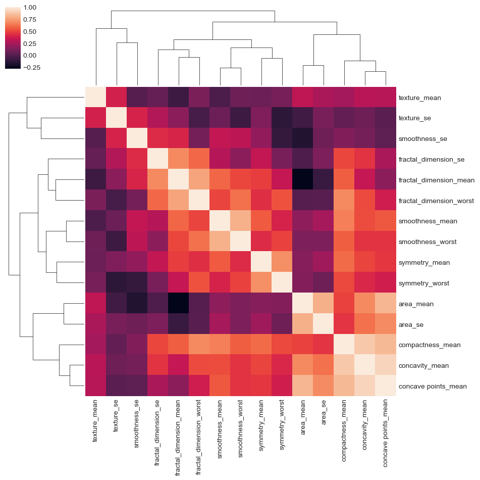
We once again see a family of features in the middle that seem to all have a correlation of .75 or greater with one another. While not as functionally understandable as features measuring area, it seems that this set of features are redundantly expressing something to do with the concavity or shape/jaggedness of the cell. We can ahead and drop those too along with the metric for worst texture. Finally, we have the cluster map below. For the most part, we have a good set of relatively unique features that should give us just about as much information as before.
Another powerful and much more mathematically driven method of feature engineering and dimension reduction is Principal Components Analysis (PCA). What PCA attempts to do is to find some set of n vectors (where n is generally the number of features in the data set). The values in each vector are a multiplicative factor that scales each feature such that the vector built maximizes the variance expressed by all the data. Each progressive vector is built as such with the condition that it must be orthogonal to all other vectors previously built. In mathematical terms, PCA finds a set of orthogonal eigenvectors such that variance is maximized in each dimension. Each of those eigenvectors is oh-so-affectionately named a principal component.
Ok. That’s admittedly not easy to understand at all especially when our data has 30 features/dimensions. Let’s try and explain this in 2 dimensions. If we have some kind of scatterplot with a bunch of points everywhere, what we’re really trying to do is draw some kind of line that expresses the “direction” in which the data varies the most. From there we then have to draw a second line that is orthogonal (or in our 2 dimensional case, 90 degrees. Mathematically defined as two vectors whose cross product is 0) from the first that then best expresses the “direction” in which the data varies the most. Perhaps the easiest example to imagine is a bunch of data that lies very closely along some kind of horizontal line on a graph. As one can imagine, when we draw our first vector, the values along the x axis vary the most so we’d draw a vector along that line. We then have to draw a vector orthogonal to that; however, since the data is very tightly bunched around the horizontal line, we wouldn’t expect to see a lot of variance in the y axis values. These two vectors that we drew are eigenvectors or principal components.
So why do we really care about all this variance and this freakily named eigenvectors (obligatory math dad-joke)? As it turns out, there are many times where a small set of features actually captures the majority of “information” for all the data. In the example above, if all the points lay very close to the horizontal line, that basically tells us that there isn’t much variance or “information” in the y values since nearly all of the data has very similar values. A common technique to to run PCA on a data set and then plot the cumulative variance explained by each dimension. This is also why is was imperative to standardize the data as mentioned at the beginning of this article since different scales across the features would skew how PCA interprets variance. The amount of variance explained by each principal component is monotonically decreasing so we can plot the cumulative variance across principal components and expect to see a curve that essentially has diminishing returns. This is captured below:

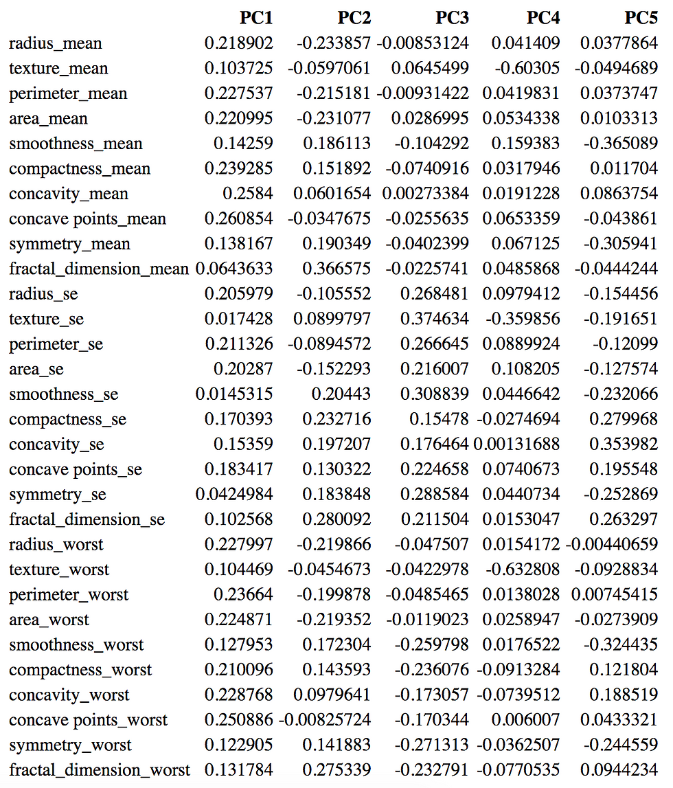
Indeed we see that almost 90% of the variance in the data can be captured by the first 5 principal components. The table below shows the loadings of the first 5 principal components. For each principal component, the magnitude of the coefficient essentially indicates how much that factor "contributes" to the variability in that dimension. The first principal component highlights a few factors that have more influence on variability in that dimension.
Another thing we can do is actually take our data from the section above where we crudely dropped a bunch of features based on correlation and run that through PCA since there are only 15 features remaining as opposed to the original thirty. We see below that the curve is roughly the same with a bit more variance explained by progressive principal components.

So why PCA? In a data set of 30 features, we effectively found a set of just 5 vectors that could express 90% of the variance or information in the data. Now we can take all of our data from before (569 by 30 matrix) and take its cross product with the 30 by 5 matrix of eigenvectors and express all of our data in a 569 by 5 matrix. As a result, we’ve greatly reduced the number of dimensions (hence dimension reduction) while still capturing about 90% of the information. As one could imagine, this is enormously helpful when we potentially have hundreds of features since it helps with computational time as well as data storage.
Prediction and Finding the Right Fit
All that remains now is to find some method of classifying whether a data point is a benign or malignant mass. The methodology behind is to first split up our data into different random chunks. The purpose of this is to have one set of data to use to teach our learning model and another set reserved to test our learning model on; these are generally called our train and test sets, respectively. A common split is to keep 80% of the data for the train set and reserve 20% for the test set.
For the purpose of this simple data set, we’ll be using a decision tree model. These models are simple and powerful but can be sensitive to slight perturbations in the data and overfitting which is why ensemble methods like random forests are generally used. One of the lines that all data scientists toe is the fine balance between a model that is too general and therefore weak vs a model that is overfitted. Essentially, we want to have some kind of algorithm (and in the case of decision trees, some set of rules) that is strong enough to help us identify data points without being overly specific. In the car analogy above, we don’t want a model that only creates a rule that says “anything that has four wheels” is a car since shopping carts, luggage cases, ATVs and many other objects can have 4 wheels; that’s a model that is too weak. On the other hand, we could potentially encounter a set of training data where a good chunk of the cars all have convertible hoods. It’d be too specific to say that all cars must have convertible hoods. This is called overfitting since; it might look good when we apply to the rule to our training data but once we expose it to our test data, we might find that our learning model has way worse accuracy. This also serves to illustrate the point above; we could have randomly split our data such that a good number of objects that were marked as cars were all red. A decision tree would pick this up and build a model that might rely on that factor too heavily, hence why they are susceptible to overfitting and perturbations in data.
To combat this, we’ll utilize a concept called k-fold cross validation. What this does is break the data into k (we’ll choose 5) chunks. We use k-1 chunks together as the train data while reserving the last chunk as test data. We then cycle through the chunks to use as train data and test data. For example, we’d use chunk [1,2,3,4] as the training data and chunk [5] as the test followed by [2,3,4,5] as the train and [1] as the test and so on. This basically allows us to train 5 different models based on 5 different sets of training data. Doing this all below, we have the following prediction accuracies:
Fold 1 Accuracy: 94.737%
Fold 2 Accuracy: 92.982%
Fold 3 Accuracy: 90.351%
Fold 4 Accuracy: 94.737%
Fold 5 Accuracy: 93.805%
This yields and average accuracy of 93.322%; not bad for a simple learning model!
Now below we can see each tree generated by each fold of K-fold cross validation:
Decision Tree Fold 1
Reading a decision tree is relatively straightforward. At every node, we have a condition to evaluate. If the condition is met, we continue to the left, otherwise we continue to the right. We keep evaluating all conditions until we hit a leaf node. The values [x,y] are representative of the number of data points that are benign and malignant, respectively that have met all conditions up until that leaf node. We can see that the mean concave points metric as well as some measure of size (area/perimeter) plays a pretty important role in classification.
In the interest of time and post length, I also fitted decision trees to the data after the 15 features we dropped and returned an average prediction accuracy of roughly 91.2%. Unsurprisingly we lose a little bit of prediction accuracy since we lose a bit of information but we essentially cut our computation time in half. Any reader is welcome to try this out or tinker around by branching the code provided!
Closing Remarks
This was a fun little side set to take a look at. While the number of variables was still comparatively small, it was a good practice to do some very rudimentary feature engineering as well as prediction. Fortunately all the data was numerical. The introduction of categorical variables in many healthcare related datasets would require some more extensive data cleaning or transformations like one hot encoding or feature hashing. Overall this was a simple way to start dabbling in a bit more visualization as well as introduce the scikit/sklearn module in Python.
Comments