


San Francisco Crime Analysis
Continuing along the trend of exploring some San Francisco data, this crime dataset was actually the first San Francisco-related data set I was interested in but decided to try my hand at the smaller eviction dataset first.
The Motivation
This dataset was actually the original set I was interested in before tackling the eviction dataset posted previously. One of the things I quickly learned about San Francisco was the distinct neighborhoods and their personalities which was quite unlike New York City where I grew up outside of. I wanted to know if these neighborhoods had deeper characteristics that extended beyond the social identities assigned to them. I wondered if, as with many other cities, San Francisco had crimes trends that were specific to neighborhoods, times of day, months of the year and such.
The Data
This dataset was a decently larger than the eviction dataset I combed through. With about 875,000 rows of data spanning over 2003-2015 and 39 different types of crime alongside geospatial data, the dataset was definitely rich enough to explore. As always, first thing I did was clean up some of the fields. I split out the timestamp column into some additional columns for aggregation such as “Year”, “Month” and “Hour” since I thought there might be some interesting temporal patterns to explore there. I also took a quick look at the most common crimes throughout the dataset which looked as follows:
Count of Crime by Type
As we can see, a good chunk of crimes are pretty uncommon whereas many are just put under the “other offenses” bin. These individual crime categories might be a little too specific and niche to attribute to each neighborhood so I decided to bucket crimes together based on where they were a violent or non-violent crime. I pulled out two data frames according to the following conditions.
Violent Crime: “Robbery”, “Assault”, “Sex Offenses Forcible”, “Kidnapping”
Non-violent Crime: “Larceny/Theft”, “Vehicle Theft”, “Burglary”
As it turns out, there are some pretty interesting distinctions that distinguish between crimes that are considered a robbery, larceny or burglary. I decided to stick with these two broad categories but the code should be clean enough easily be adapted to explore whatever crimes a user might be interested in with some basic refactoring.
The Questions
As with any exploratory analysis, the first thing I wanted to do was answer some high level questions:
Is there some kind of pattern for crime by time of day? By month? By Year?
If so, do these patterns change based on the type of crime?
How does the distribution of crime throughout San Francisco neighborhoods look?
The Analysis - Violent Crime
Right. First things first; how does crime fluctuate throughout different time intervals?
At the highest level, the monthly data didn't present anything too interesting with the exception of the month of December. There are peaks in May and October with a lull in the summer and winter. To my knowledge, San Francisco has a relatively migratory population meaning that, especially since the Silicon Valley boom, many people are not native to San Francisco and travel during the holiday season which may account for the lower crime counts during December.

The hourly breakdown below is more interesting but hardly surprising. The early hours of the morning (from 4-9) has understandably low counts for violent crime. What did stand out to me, however, was that the number of crimes increases pretty steadily during that time period before a sudden spike at noon. My only guess is that lunch hour could potentially mean more people out and about the city which translates to more targets. The other interesting point is that crime occurrences seem decently steady throughout the night before a sudden jump around midnight to 1AM. If we took out the Hour 0 bar, the transition from hour 23 to hour 1 seems pretty smooth. I am wary of trying to fabricate theories as to why there is a spike between midnight and 1AM, but if I were to hazard a guess it may be because the BART system closes around that hour which may mean in a spike in ridership and people moving towards predictable locations which may leave them susceptible to violent crime.


One thing that is interesting to note here is the difference in distribution between violent and and non-violent crime. Whereas violent crime sees a surge around midnight and the late hours of the night, non-violent crime sees very large swells around noon and 5-7PM when workers finish their work day. From this point on, we'll just focus on the violent crime data.
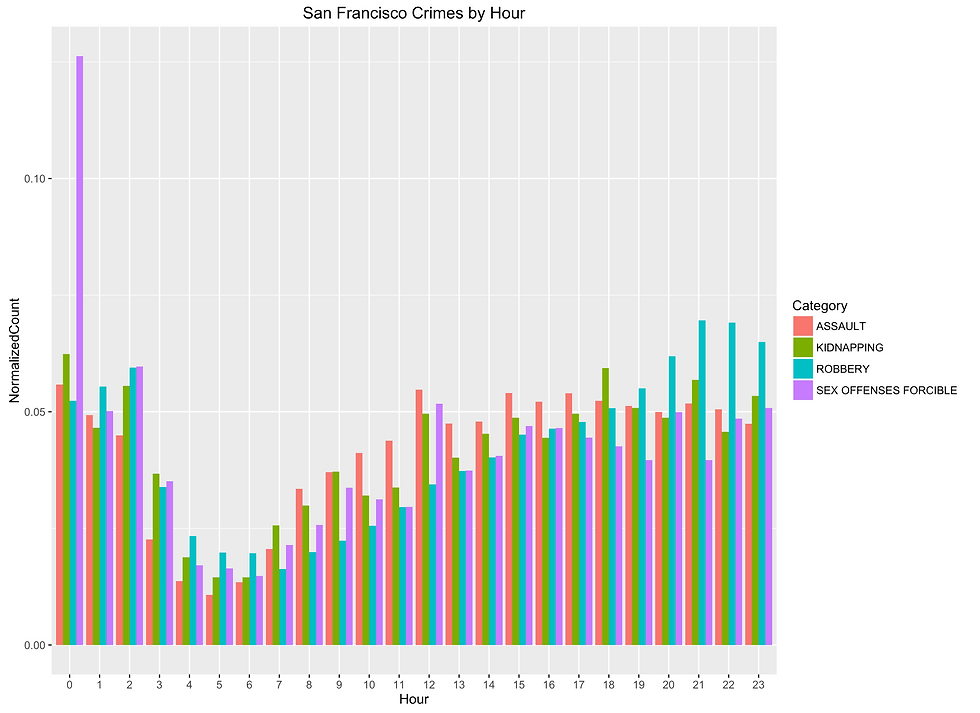
One danger of aggregating all the types of crime into a simplified “Violent” bucket is that there could potentially be outliers or an interesting trend in one category of crime that is masked by the other three types. Essentially the voice of one is drowned out by the voice, in our case the data, of many. After a breakdown by category, it quickly became obvious that the suspicion was well-founded. The spike at noon was mainly caused by “Assault” type crimes. Also worth noting is that between midnight and 3am, assaults decrease while robberies actually increase. The most noticeable anomaly however, is that there is a sizable peak in forced sex offenses at midnight which may very well align with night life.

One thing that obfuscated the clarity of the crimes by hour plot was how tiny some of the bars were compared to others. Understandably, this was a result of there just being far fewer crimes perpetrated for forcible sex offenses compared to something like assault. To remedy this, I normalized the data by just taking the value in that hour for the crime and dividing it by the total count of that type of crime for the day. When this was done, a much more interesting plot presented itself. An absolutely enormous spike in forcible sex offenses was revealed (I hesitate to the use the word “appeared” since that behavior was always in the data but just not apparent without probing the data in a different manner). Additionally, the values for this particular type of crime are abnormally high from hours 23-2 which very well coincides with nightlife in the city.
After taking a look at those numbers, I decided to turn towards some GPS data and visualizing the locations of crimes on a map. The first thing I did was plot every single violent crime throughout the years of the dataset. It became pretty obvious that this kind of plot (as shown below) wouldn’t reveal too much since dots began to be drawn on top of each other and there was no way to properly discern just how many crimes may have happened in a particular locale. However, this map was still enough to show that a good amount of violent crime was centered around the heart of the city while violent crimes were rare in parks or less residential areas like Golden Gate Park and Presidio.


To better understand the frequency of crime, I split out the four different types of violent crime and then plotted heat maps of each crime. What came out was much more revealing; certain types of crime were extremely concentrated while others were more evenly diffused throughout the city. On the heat maps below, green corresponds with a lower density whereas red represents higher density. The most concentrated crime by far is Assault (although Robbery looks similar as well) and it looks to be centered around the Tenderloin which is well-known for being one of the more dangerous neighborhoods in San Francisco. Kidnapping and Forced Sex Offenses seem to be more evenly spread out over the city. What the heat map does a good job of doing is showing that the count of crimes in the southern and western portions of the city that looked decently numerous in the previous dot plot is actually relatively insignificant compared to the concentration of violent crime in the city. One thing to note though is that the areas with higher concentrations of violent crime also has a higher population density.

As always, I like to take a look at the movement of data on a time basis by graphing all the points per year and then compiling it into a gif. I find that seeing the change visually is a strong way of conveying patterns and trends (read as: I really like making gifs). Below is a gif portraying the movement of crime throughout the years (this dataset only includes data partway through 2015 so the sudden drop off in crime is a result of lack of complete data and unfortunately not a sudden plummet in crime).

The below heat map is actually quite interesting. The concentration of assault-related crimes is actually fairly steady throughout the day with the vast majority of the crime being centered a specific region. Moving in a clockwise fashion, the density of kidnapping crimes actually changes a decent amount throughout the day. The early hours of the morning (around 3-4) sees a very even distribution of the crime throughout the city but as the day progresses (and particularly around midnight), the crime becomes increasingly centered around the more urban area of San Francisco. Forcible sex offenses is a bit more concentrated in the urban areas but a peak in the density of offenses presents itself in the hours surrounding midnight. Lastly, for robbery the epicenter of the crime coincides with the same area as the one for assault but interestingly, a second bubble forms in the southwest (near the Mission) around midnight and the hours after which coincides the popular advice that the Mission is known to be a bit more rough post-sundown and late into the night.

Guess the Crime
With a mix of categorical and numerical data, I decided to utilize decision trees. For those unfamiliar, decision trees essentially have branches that state “rules.” A data point is evaluated against a rule and redirected until a leaf node is hit and the resulting value is the prediction for the data point. Think of it as a troubleshooting diagram for a car when you have a check engine light; a first step might be “is the car on” followed by an if-then and more splits before some kind of diagnosis is returned.
However, one of the downfalls of decision trees is that they are very prone to overfitting (especially without pruning) and are highly sensitive to changes in data points. Understandably, the decision at a branch (and as a result, the entire tree) can be completely different based on the set of training data. To ameliorate both of these issues, ensemble methods and namely random forests are used. Random forests are essentially many decision trees run at the same time that then outputs the majority vote between all the decision trees as the prediction of the random forest.
For my model, I split the data into 75% train and 25% test and tried a combination of predictors. After trying a few different combinations of predictors, it seemed like a mix of longitude, latitude, hour, day of week and police district provided the best model with an accuracy of 69.8%. Unfortunately, this is by no means a good accuracy. Below is the table of predictions against actual values. The rows represent the prediction and the columns represent the actual value. So, for example, the model predicted that data points were Assault 517 times when they were actually Kidnappings.

One thing that I had to be careful of was that I actually trained models that had an accuracy of 72.2%. One might wonder why I would reject those models but looking at the table of predictions below, it becomes quite obvious that the vast majority of predictions were made as Assaults by virtue of there being many more crimes that fall under that category so just predicting Assault actually resulted in a model with higher accuracy but is in reality quite a useless model. A skewed mode in the data and a predictor like a random forest/trees is susceptible to voting with the masses.

Final Thoughts
As a relatively new Bay Area resident, one thing that I have noticed about San Francisco is that areas known for being relatively crime-ridden aren’t constrained to certain geographical regions like they are in New York (i.e. Harlem Bronx, etc). Rather, one of the striking impressions I got was that just crossing a few streets could have one see multiple changes in characteristics. However, as this dataset has shown, the majority of violent crime is centered near Tenderloin which has a reputation for being relatively unsafe.
One thing that was interesting was that while assault happened nearly uniformly across the city, kidnappings and forcible sex offenses were concentrated in the more urban area of San Francisco. In particular, without making sweeping over-generalizations, the latter of the two may have to do with the location of bars and nightlife. This association might be supported by the particularly enormous normalized spike in forcible sex offenses around midnight. In terms of time of day, most crimes see a swell during noon and 5/6 PM which may have to do with when more of the population is out and about during lunch hours and ending the work day.
Overall, the data revealed some interesting underlying trends in how violent crimes may be perpetrated that may not be obvious at first thought. The ebb and flow of crime during certain times of day and night is particularly interesting. So what can we do with this data? While the predictive model was relatively weak, perhaps using the police district/zip code/location covariate in addition to the trends observed might help law enforcement decided where best to staff units to best protect the city. For example, after seeing the normalized graph of crime, it might be prudent to have units start in areas more robberies around hour 20-23 followed by patrolling areas with heavy nightlife around midnight when the spike in forcible sex offenses occurs and before finally moving to areas where it seems robberies and kidnappings spike again in hours 1 and 2. Regardless of the course of action, having a general knowledge of crime breakdown in the city is sure to be educate both law enforcement and the general public.
Check out the code here: SF Crime Analysis on GitHub
Comments